|
| 
|

4) Basic Lighting Techniques:
Getting your hands dirty
The necessary contrasts are not listed within the color values;
that would be too simple. In fact, the diverse parameters
in a Light Actor contain many possible sources for contrast.
You are not supposed to rely only on the color (which corresponds
to the Hue and Saturation properties) but also their Brightness
and Radius. In the first case, one could juxtapose great differences
in brightnesses or, in the second case, juxtapose Light Actors
with very different Radii. It goes without saying that you
can, of course, mix these contrasts to obtain even better
ones (and it is strongly advised you do). Thus, for example,
a Cyan Light Actor with a high Saturation, a high Radius,
and a low Brightness would contrast an Orange Light Actor
with low Saturation, low Radius, and high Brightness. This
would also apply to the other colors, and their respective
complementary hues.
Even if the most instructive knowledge base is Classical Art
History (don’t be afraid to go to a museum to closely
study the masters, or spend time surfing sites that specialize
in reproductions, which you will easily find thanks to Google…)
it is not absolutely indispensable to master this domain in
order to become a competent artist. Most of the official maps
will suffice; some examples:
|
|
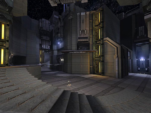
DM-Goliath: the archetype of
‘pure’ primary and secondary light colors because
the Blue/Cyan is directly opposed to Orange. This is a harmony
of colors often seen in cinema, particularly in those with dark
atmospheres. Here, the primary colors are directly juxtaposed
with the corresponding secondary colors thanks to the very achromatically
chosen textures in a particular package. During UT99’s
time many amateur level designers used very neutral texture
packages – with the Richrig package at
the top of the list - in order to light their levels in the
colors of their choice (see DM-1on1-Trite for
another example drawn from UT2004). This technique
is effective and perfectly respectable, but there is a certain
‘ease of execution’ that rarely satisfies a proper
artist. Once you’ve used it a few times, you will certainly
want to try something else and experiment with different combinations
where your personal taste will have more room to grow.
|
|
DM-DE-Osiris2: See how the yellow-orange
ambient light is strong (with a high Radius and Brightness)
opposed to the green nuances that are more specific and discrete.
Also note the contrast is subtle; with the general yellow-orange
tones, the complementary colors should be between Violet and
Cyan, however the author chose Green. The reason is simple enough.
The textures within the packages that contain the Egyptian-theme
are composed primarily of materials in yellow, sandy colors
– ‘warm’ colors because of their resemblance
to colors in flame. Opposed to which the Cyan and Azure tones
– ‘cold’ because of the opposite of ‘warm’
explained above – generally function badly. Why? Because
these textures, the Yellow-Orange, contain little Blue and therefore
cannot reveal these colors when lit. It would result in a ‘dirty’
color that would be less attractive. Therefore the choice of
Green becomes essential because its origin lies with the blend
of Cyan and Yellow (see the Color Circle).
And this same Yellow is the dominant color in textures using
the Egyptian theme: the interaction between a Light Actor and
the texture it lights works better when they share a common
tone as shown in the above screenshot.
|
|
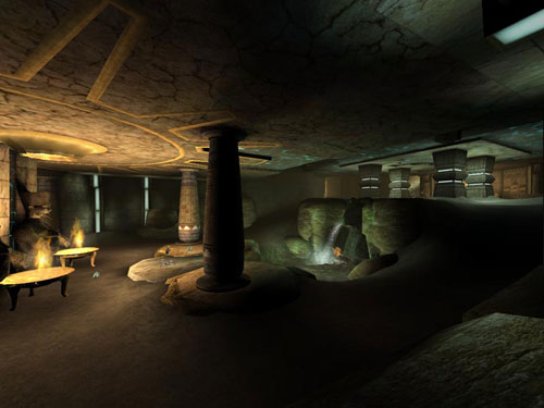
Finally, DM-Insidious. In spite
of its simplicity in terms of layout, and therefore gameplay,
its lighting qualities are very interesting due to their variety.
Especially so since they contradict many of the recommendations
that I have explained thus far – but I would probably
not be the first to say that art is not an exact science. Regard
how the Red in the central lava pits is radically and directly
opposed to the Green of the cloning tanks on the left, and also
regard how the curved walls on each side of the screenshot are
lit by a pale Purplish-Blue. The texture package used is dominated
by Chestnuts and Ochres with, discrete, more or less, points
of Orange and Green. Recall what I said about Chestnut: this
‘color’ is the sum of all the others in equivalent
quantities in the CMY spectrum. This allows the author to use
a wide variety of colors in the same location. In fact, one
can find all the major colors of the RGB spectrum in this one
zone of the level. Of course, the dominant Green is clearly
distinguished from the Blue and Red due to the intensive use
of DistanceFog.
Note: Not for nothing is Green so often used when taking
into account its position in the RGB spectrum: indeed, located
halfway between two extreme colors, it supplements them both
without creating a ‘violent’ contrast in a spectator’s
eyes. If you are hesitant about choosing a color, Green is often
an ideal candidate in many situations.
Notes:
- Choosing the number of colors to use in a level is often difficult.
Too few, and there is a lack in contrast; too many and the eyes
begin to object. Personally, my preference is three (an important
figure for all creative outlets, at least in the field of Pictorial
Art). Two complementary colors and a third, more sporadically
placed, to introduce some variety. I have already given examples
of levels using fewer than three colors (DM-Gestalt
and DM-Icetomb) but you will find this is the
exception rather than the rule. At any rate, I strongly recommend
that you do not exceed five, of which two will certainly be
very specific (ie. with low Radii). Of course, it goes without
saying that tonal differences obtained by simple saturation
changes are not, strictly speaking, different colors (a pale
Yellow is barely distinguishable from a darker shade of Yellow)
but a Yellow and Orange – only one example, I could easily
choose Blue and Green, or Red and Purple – are obviously
two different colors.
- Light sources should match the Light Actors. For each Light
Actor in the level, there should be a reason for the light to
exist: either through a texture indicating a light (in UT99,
for example), or a static mesh light (for UT2Kx).
It could be a normal lamp, a sign over a store, or even a computer
console. Do not hesitate to note the objects that surround you
in everyday life to observe how they produce light and can thus
inspire you to develop lighting ideas. Of course, it is also
strongly recommended to study the levels provided by the game
itself. However, opposed to what certain level sites and review
sites indicate, it is not always necessary to have a light source
paired with each Light Actor in a level. Sometimes a simple
lack of light in a zone can lead you to use a Light Actor which
does not correspond to any obvious source, especially when simulating
radiosity. What is that then? I’ll tell you…
5) Radiosity: Reproducing ‘bounce’
light
Light doesn’t light only the objects it touches: its
rays travel from the source, to the objects, and then are
reflected back until they reach your eyes, which enables you
to see them. But it is not truly that simple. Light rays ‘rebound’
all over, like a squash ball, and each time, they lose some
of their color based on the object from which they are being
reflected. Certain rendering methods can reproduce this highly
complex mechanic, but it is not yet possible in real-time
because such a process consumes enormous calculation resources
with a lackluster result; especially when there are ways to
simulate this with more or less success depending on your
control over the subjects.
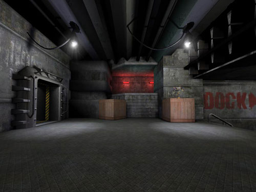
Here is an example from DM-Injector:
|
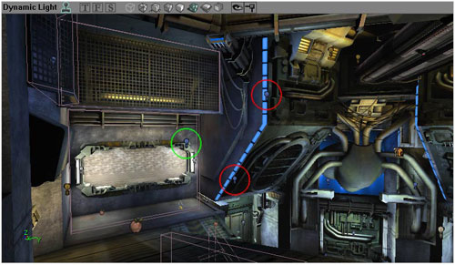
|
In the red circles, the Light Actors generate
the principle lighting placed, as they should be, near the source
(here the ‘blue neon’). In the green circle, a third
Light Actor reproduces the reflection of the basic blue light
on the immediate area around the neon. If you look at the properties
of each of the Light Actors in UEd, you will see that their
color properties (Hue and Saturation) are practically identical
(Hue = 150 instead of 153 for the Light Actor in the green circle),
but their Brightness and Radii are less than half that of the
one in the green circle (112.5 and 36 for the green Light Actor,
and 300 and 18 for the Red, respectively). These variations
are explained by the fact that the more often light is reflected,
the more it loses its luminosity (Brightness) on each object
as more light is absorbed. On the other hand, the quantity of
the remaining light is spread across a wider surface, proportional
to that which came from the initial source, expressed here by
the Radius property.
A small explanatory diagram of this principle:
|
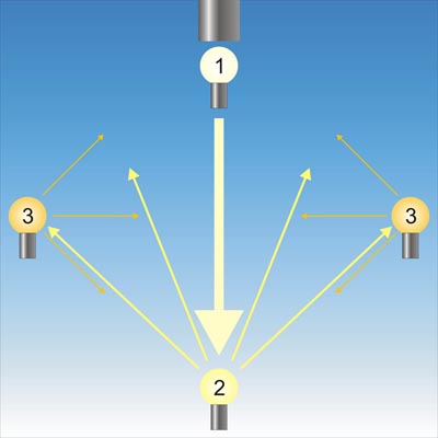
|
A light in a cubic room as seen from the side:
On top, the primary light source (a normal ceiling light), with
a Light Actor (1) that represents the light emitting from the
light source. Directly below, at ground level, a second Light
Actor (2) reproducing the reflection of the
light from the primary light source on the ground. Finally,
on the side walls, two other Light Actors (3)
that share the same properties and represent the light reflected
by the first reflection (2) onto the walls.
The size of the arrows and their color represent the light’s
path and the loss of its Brightness, and their quantity indicates
the Radius of the lights as it becomes more diffused after each
reflection. Of course, this is only a diagram; you are not required
to use this exact number of Light Actors for each light source.
In fact, most of the time, two are mostly sufficient, and more
than three can quickly cause your level’s lighting to
become a nightmare. But more importantly, their impact on performance
will be prohibitory. Keep things fairly simple, it’s complicated
enough already.
Note: The loss of light in the diagram and in the DM-Injector
example is over-simplified; it’s only one aspect of the
principle. Indeed, it is usually not enough to simply modify
the Brightness and Radius properties to obtain a good radiosity
simulation. In fact, the reflected color depends on the color
of the material on which the light is reflected. For example,
a White light reflecting off a Red wall will be almost exclusively
Red, or Green if reflected off a Green wall, or Blue off a Blue
wall. Somewhat unfortunately, the texture packages seldom use
uniform colors – often this is what distinguishes good
textures from bad, but this is not the level designer’s
problem. This means that a ‘realistic’ radiosity
simulation would rapidly become a nightmare. To simplify the
property settings I propose you modify the color of the Light
Actor by obscuring it quite simply: this can be done by choosing
a similar color tone but of a slightly different Hue (for example,
blacker) or by choosing a color closer to Red or Blue along
the RGB spectrum, according to the initial position of the basic
tone. (Thus a Yellow light would reflect a more Orange color,
an Orange a more Reddish-Orange, a Green a more Greenish-Blue,
etc…) People whom, like me, come from a pre-rendered 3D
background know these tricks well and we have each developed
our own techniques: it’s up to you to create your own…
Note: The quantity of light reflected by a surface
depends entirely on its roughness; the smoother a surface is
the more light it reflects. This is because the less smooth
a surface is the more ‘chaotic’ it is, at least
at the atomic level. This will reflect light in more directions
as the light touches more ‘peaks’, and the spaces
between the peaks, where it will lose more and more brightness
and colors without leaving the surface, instead of returning
all in the same direction. Thus glass, being one of the smoothest
surfaces reflects, almost all the light it receives. Contrarily,
rough wood, for example, reflects very little light and must
be varnished to achieve any sort of reflection. It’s useless
to state that this optical mechanism plays a paramount role
in the Level Design process; a very new or wet environment will
probably be very luminous whereas an older environment, rusty
and mildewed, would certainly be darker.
The Easy Way: Experienced Designers often use two Light
Actors for the same principle light source: the first with ‘normal’
properties, and the second with the same color but placed a
few units beside the first and with a Brightness two to four
times less, and a proportionally increased Radius. This trick
makes it possible to obtain the effect of very diffused lighting
by softening the luminosity. Moreover, placing both Light Actors
close together makes it possible to avoid overlapping shadows
– an unquestionable ‘defect’ in environmental
realism – but also makes them fuzzier and thus more ‘true’
because exact shadows are practically absent in nature.
6) Advanced Techniques: Special Cases
a) Lightboxes:
When you place a ceiling light in your level, its light on the
ground and the immediate environment can be achieved through
particular settings, and is strongly advised. Opposed to numerous
claims (which I largely contribute to the propagator, mea culpa,
mea magna culpa) it is not DavidM who invented
this trick, but is CliffyB, proof of which
is in his Unreal
Tournament Level Design Musings where he explains rather
summarily “You can use CYLINDER lights to create nice
sharp circles of light on the floors and ceilings of your maps,
but don’t depend on them. They tend to light player actors
very poorly. Try to use a combination of regular lighting and
cylinder lights in special areas.” Basically, the trick
consists of using a series of two to three Light Actors laid
out vertically under the ceiling light. The different property
settings will allow you to reproduce the famous Lightbox effect,
improperly named because it reproduces more a cone of light
rather than a box.
Here is an example from CTF-December:
|
|
Even if DavidM did not invent
this trick, then he certainly popularized it, among other things,
by developing a method with precise properties which you will
find in detail (for UT99, but is easily adapted
for UT2Kx) on his personal site.
An interesting alternative but underused can be found in DM-DE-Grendelkeep:
LightEffect LE_StaticSpot makes it possible
to create a light cone in a strict sense, Set the Light Actor’s
properties as such:
- Light Properties -> Advanced -> bDirectional = True
and point the small arrow that appears toward the ground.
- Light Properties -> Light -> LightEffect = LE_StaticSpot
and you should see the light reduced to a circle on the ground.
Modify the Radius to change the size of the light circle –
as if it was the Brightness – and do not forget to place
a second Light Actor on the ground to simulate the reflection
of the light on the environment as previously explained.
It goes without saying that this trick is not exclusively
reserved for ceiling lights. There are many possible applications.
It’s up to you to explore them.
b) “Red Lights”:
Once again, something that is incorrectly attributed to DavidM:
these have existed since at least Quake 2,
and one can find many examples in Unreal 1
and UT99. They are often used in industrial
or futuristically-themed maps, especially in dark corners –
even straight-up black – where they function best. Here
are their properties:
- Brightness = 200
- Hue = 0
- Saturation = 0
- Radius = between 6 and 10 (this last value is strictly
interpretive, but try to avoid moving beyond it; pure red
generally looks bad on large open surfaces.)
c) Static Spots:
This ‘alternative’ to Lightboxes
makes it possible to represent projected light from a directional
light source, as its name suggests, in a precise direction.
Indeed, an error usually made in Level Design consists of placing
a standard Light Actor at a light source that emits light only
in a certain direction. A Light Actor emits light in 360°
thus the walls around are also lit whereas the light rays from
a directional source should be confined to one direction. For
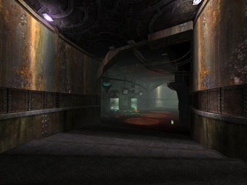
example, in DM-Rankin:
|
|
The problem is rather obvious here: the static
meshes used to light this corridor obviously consist of pairs
of fluorescent lights surrounded in a metal housing which should
block the light around the fixture in reality. However, this
is not the case: the beam which holds the ceiling lights is
also lit by them. The choice of a different static mesh could
have solved the problem.
Now, see how the Light Effect LE_StaticSpot
can provide a much more credible variation: DM-Oceanic:
|
|
With the StaticSpot directed downwards and slightly
facing the wall, and regulating its falloff, the level designer
made realistic lighting by accounting for the selected light
source; the Light Actor does not light the area behind the light
source. Also, see how the light cones decorate the walls; without
this effect, the walls would seem empty. Thus, this is an easy
way to decorate certain zones in the level without using polygons
or textures which use more resources, and can sometimes even
obstruct gameplay. It should be noted that the author could
have added a Light Actor against the wall in order to simulate
the reflection of light off the wall towards the corridor’s
interior.
This can be a way to think about light as you create your own
static meshes. Attentively observe the light sources that surround
you, in your home, for example, and you will become capable
not only of using this method appropriately, but also able to
create static meshes that allow you to exploit this better.
In general, fluorescent lamps illuminate the area around themselves,
since there are generally no obstacles around them – as
seen in DM-Rankin – whereas normal lights
are often placed to light a specific direction; even when there
is a lamp shade that lets some weak light through, the greatest
amount exits through the top and bottom. This prevents the light
from being too dazzling and, in a way, it’s rather similar
to halogen floor lamps which generally light a room by reflecting
the light off the walls and ceiling, this is usually how professional
photographers work: they never light the subject of their photos
directly, instead they use indirect lighting to get a smooth
and homogeneous light around it, even outdoors.
...Continued in Part 3: Special
Cases
|
 |
|
|
|


|